이건은 R을 처음 시작 하는 사람을 위한 것이고, 가장 기초적인 것을 나타낸다. 하지만, R은 기초가 조금 어려운 부분이 있다. 기초 적인 부분이 잘 정리 되면, R은 쉽게 접근 할 수 있다.
1-1. THE R BOOK 옮긴이의 말
현업에 계신 분들은 아시겠지만 데이터 분석은 혼자서 하는 작업이 아닙니다. 데이터 분석 결과에 의미가 있으려면 반드시 분석 대상이 되는 분야에 대해 깊이 이해 해야 합니다.
이러한 기반 하에서 관련 데이터 프로그래밍 기술과, 데이터 분석기술, 통찰력을 발휘하여 의미있는 결과를 만들어 내는 것입니다.
 |
| THE R BOOK |
1-2.R 설치
PC나 Mac을 설치 할 때 인터넷에 접근 되면, 아주 간단하게 설치 할수 있습니다. 아래의 URL을 클릭 하면 설치 할 수 있습니다.
http://cran.r-project.org/
설치 하려면, 다음만 지속적으로 클릭 하면 됩니다.
R의 버전 중에서 Linux나 Mac 버전은 매우 안정적 입니다. 최근 추세는 Linux를 기반으로 하여 도커 컨테이너 사용이 추세 입니다. 오늘 강의 중 윈도우 세팅이 잘 안되시는 분 들에 한해 도커 컨테이너 URL 사용을 공유 하겠습니다.
1-3. Rstdio 설치
PC 나 Mac에서 설치 하려면 설치 할 때, 인터넷에 접근 되면, 아주 간단하게 설치 할수 있습니다. 아래의 URL에서 해당되는 O/S 버전을 클릭 후 다운 받아 실행 하면 됩니다.
https://www.rstudio.com/products/rstudio/download/#download
RStudio를 설치 하고 나서, 실행 할때는 반드시 관리자 권한으로 실행 해야 합니다. 아래의 아이콘만 클릭 하면 Windows R설치의 모든 문제가 해결 됩니다. |
| 관리자 권한 실행 |
1-4. R실행
R을 처음 실행 할때, ‘R은 자유 소프트웨어이며, 어떠한 형태의 보증없이 배포됩니다.’ 라는 멘토가 나옵니다.
R의 핵심 개발자에 대한 내용을 알고 싶으면 아래와 같은 명령어를 치시고, shift+enter 치시면 됩니다.
citation()##
## To cite R in publications use:
##
## R Core Team (2021). R: A language and environment for statistical
## computing. R Foundation for Statistical Computing, Vienna, Austria.
## URL https://www.R-project.org/.
##
## LaTeX 사용자들을 위한 BibTeX 항목은 다음과 같습니다
##
## @Manual{,
## title = {R: A Language and Environment for Statistical Computing},
## author = {{R Core Team}},
## organization = {R Foundation for Statistical Computing},
## address = {Vienna, Austria},
## year = {2021},
## url = {https://www.R-project.org/},
## }
##
## We have invested a lot of time and effort in creating R, please cite it
## when using it for data analysis. See also 'citation("pkgname")' for
## citing R packages.놀랍게도 R Core 팀이 오스트리아 비엔나에 있습니다. 즉 공헌자의 내용을 볼수 있습니다.
그리고, 아래는 우리가 가장 많이 사용하는 패키지인 dplyr의 개발인원의 정보를 볼 수 있습니다.
citation("dplyr")##
## To cite package 'dplyr' in publications use:
##
## Hadley Wickham, Romain François, Lionel Henry and Kirill Müller
## (2022). dplyr: A Grammar of Data Manipulation.
## https://dplyr.tidyverse.org, https://github.com/tidyverse/dplyr.
##
## LaTeX 사용자들을 위한 BibTeX 항목은 다음과 같습니다
##
## @Manual{,
## title = {dplyr: A Grammar of Data Manipulation},
## author = {Hadley Wickham and Romain François and Lionel Henry and Kirill Müller},
## year = {2022},
## note = {https://dplyr.tidyverse.org, https://github.com/tidyverse/dplyr},
## }이것은 해들리 위컴 박사가 주도 해서 만든 것이다. dplyr 사용하기 이전에는 어느 누구도 따라 하기 힘든 정규화표현식 (regular expression:regexp)으로 모든 데이터를 조작(data manipulation)을 하였습니다.
하지만, 지금은 데이터 조작의 주요 기능은 filter, 변수 삽입, 테이블 조인, 집계등을 매우 손쉽게 할 수 있습니다.
1-5 함수에 대한 예제
R을 분석 할때, 가장 기본 적이고 많이 사용하는 평균에 대한 예제를 볼수 있습니다.
example("mean")##
## mean> x <- c(0:10, 50)
##
## mean> xm <- mean(x)
##
## mean> c(xm, mean(x, trim = 0.10))
## [1] 8.75 5.50처음 보시는 분은 평균인데, 무슨 내용인지 의아해 할 수 있습니다. 차근히 말씀드리면 0~10까지 수를 나열 하고, 50을 더 넣은 것입니다. 그런 다음에 평균을 구하고, 10% 절사평균을 구한 것입니다.
추가로 함수에 대한 데모도 볼 수 있습니다.
demo(graphics)##
##
## demo(graphics)
## ---- ~~~~~~~~
##
## > # Copyright (C) 1997-2009 The R Core Team
## >
## > require(datasets)
##
## > require(grDevices); require(graphics)
##
## > ## Here is some code which illustrates some of the differences between
## > ## R and S graphics capabilities. Note that colors are generally specified
## > ## by a character string name (taken from the X11 rgb.txt file) and that line
## > ## textures are given similarly. The parameter "bg" sets the background
## > ## parameter for the plot and there is also an "fg" parameter which sets
## > ## the foreground color.
## >
## >
## > x <- stats::rnorm(50)
##
## > opar <- par(bg = "white")
##
## > plot(x, ann = FALSE, type = "n") |
| 라인 점선 그래프 |
##
## > abline(h = 0, col = gray(.90))
##
## > lines(x, col = "green4", lty = "dotted")
##
## > points(x, bg = "limegreen", pch = 21)
##
## > title(main = "Simple Use of Color In a Plot",
## +       xlab = "Just a Whisper of a Label",
## +       col.main = "blue", col.lab = gray(.8),
## +       cex.main = 1.2, cex.lab = 1.0, font.main = 4, font.lab = 3)
##
## > ## A little color wheel.    This code just plots equally spaced hues in
## > ## a pie chart.    If you have a cheap SVGA monitor (like me) you will
## > ## probably find that numerically equispaced does not mean visually
## > ## equispaced.  On my display at home, these colors tend to cluster at
## > ## the RGB primaries.  On the other hand on the SGI Indy at work the
## > ## effect is near perfect.
## >
## > par(bg = "gray")
##
## > pie(rep(1,24), col = rainbow(24), radius = 0.9)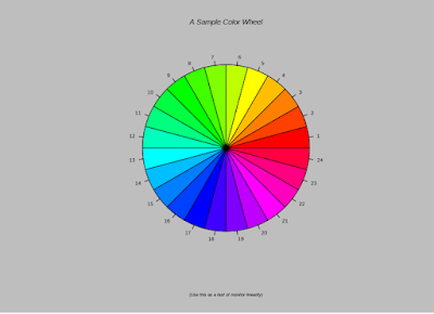 |
| 파레트 차트 |
##
## > title(main = "A Sample Color Wheel", cex.main = 1.4, font.main = 3)
##
## > title(xlab = "(Use this as a test of monitor linearity)",
## +       cex.lab = 0.8, font.lab = 3)
##
## > ## We have already confessed to having these.  This is just showing off X11
## > ## color names (and the example (from the postscript manual) is pretty "cute".
## >
## > pie.sales <- c(0.12, 0.3, 0.26, 0.16, 0.04, 0.12)
##
## > names(pie.sales) <- c("Blueberry", "Cherry",
## +              "Apple", "Boston Cream", "Other", "Vanilla Cream")
##
## > pie(pie.sales,
## + col = c("purple","violetred1","green3","cornsilk","cyan","white")) |
| 파이차트 |
##
## > title(main = "January Pie Sales", cex.main = 1.8, font.main = 1)
##
## > title(xlab = "(Don't try this at home kids)", cex.lab = 0.8, font.lab = 3)
##
## > ## Boxplots:  I couldn't resist the capability for filling the "box".
## > ## The use of color seems like a useful addition, it focuses attention
## > ## on the central bulk of the data.
## >
## > par(bg="cornsilk")
##
## > n <- 10
##
## > g <- gl(n, 100, n*100)
##
## > x <- rnorm(n*100) + sqrt(as.numeric(g))
##
## > boxplot(split(x,g), col="lavender", notch=TRUE) |
| 박스플랏 |
##
## > title(main="Notched Boxplots", xlab="Group", font.main=4, font.lab=1)
##
## > ## An example showing how to fill between curves.
## >
## > par(bg="white")
##
## > n <- 100
##
## > x <- c(0,cumsum(rnorm(n)))
##
## > y <- c(0,cumsum(rnorm(n)))
##
## > xx <- c(0:n, n:0)
##
## > yy <- c(x, rev(y))
##
## > plot(xx, yy, type="n", xlab="Time", ylab="Distance") |
| 폴리건 |
##
## > polygon(xx, yy, col="gray")
##
## > title("Distance Between Brownian Motions")
##
## > ## Colored plot margins, axis labels and titles.    You do need to be
## > ## careful with these kinds of effects.    It's easy to go completely
## > ## over the top and you can end up with your lunch all over the keyboard.
## > ## On the other hand, my market research clients love it.
## >
## > x <- c(0.00, 0.40, 0.86, 0.85, 0.69, 0.48, 0.54, 1.09, 1.11, 1.73, 2.05, 2.02)
##
## > par(bg="lightgray")
##
## > plot(x, type="n", axes=FALSE, ann=FALSE) |
| 거리 모션 차트 |
##
## > usr <- par("usr")
##
## > rect(usr[1], usr[3], usr[2], usr[4], col="cornsilk", border="black")
##
## > lines(x, col="blue")
##
## > points(x, pch=21, bg="lightcyan", cex=1.25)
##
## > axis(2, col.axis="blue", las=1)
##
## > axis(1, at=1:12, lab=month.abb, col.axis="blue")
##
## > box()
##
## > title(main= "The Level of Interest in R", font.main=4, col.main="red")
##
## > title(xlab= "1996", col.lab="red")
##
## > ## A filled histogram, showing how to change the font used for the
## > ## main title without changing the other annotation.
## >
## > par(bg="cornsilk")
##
## > x <- rnorm(1000)
##
## > hist(x, xlim=range(-4, 4, x), col="lavender", main="")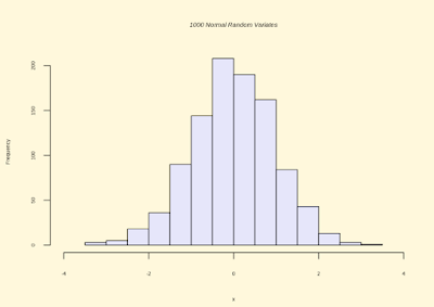 |
| 히스토그램 |
##
## > title(main="1000 Normal Random Variates", font.main=3)
##
## > ## A scatterplot matrix
## > ## The good old Iris data (yet again)
## >
## > pairs(iris[1:4], main="Edgar Anderson's Iris Data", font.main=4, pch=19) |
| 산점도 |
##
## > pairs(iris[1:4], main="Edgar Anderson's Iris Data", pch=21,
## + bg = c("red", "green3", "blue")[unclass(iris$Species)]) |
| 클러스터 산점도 |
##
## > ## Contour plotting
## > ## This produces a topographic map of one of Auckland's many volcanic "peaks".
## >
## > x <- 10*1:nrow(volcano)
##
## > y <- 10*1:ncol(volcano)
##
## > lev <- pretty(range(volcano), 10)
##
## > par(bg = "lightcyan")
##
## > pin <- par("pin")
##
## > xdelta <- diff(range(x))
##
## > ydelta <- diff(range(y))
##
## > xscale <- pin[1]/xdelta
##
## > yscale <- pin[2]/ydelta
##
## > scale <- min(xscale, yscale)
##
## > xadd <- 0.5*(pin[1]/scale - xdelta)
##
## > yadd <- 0.5*(pin[2]/scale - ydelta)
##
## > plot(numeric(0), numeric(0),
## +      xlim = range(x)+c(-1,1)*xadd, ylim = range(y)+c(-1,1)*yadd,
## + type = "n", ann = FALSE) |
| 동고선도 |
##
## > usr <- par("usr")
##
## > rect(usr[1], usr[3], usr[2], usr[4], col="green3")
##
## > contour(x, y, volcano, levels = lev, col="yellow", lty="solid", add=TRUE)
##
## > box()
##
## > title("A Topographic Map of Maunga Whau", font= 4)
##
## > title(xlab = "Meters North", ylab = "Meters West", font= 3)
##
## > mtext("10 Meter Contour Spacing", side=3, line=0.35, outer=FALSE,
## +       at = mean(par("usr")[1:2]), cex=0.7, font=3)
##
## > ## Conditioning plots
## >
## > par(bg="cornsilk")
##
## > coplot(lat ~ long | depth, data = quakes, pch = 21, bg = "green3")
##
## > par(opar)
다양한 그래프를 보실수 있습니다. 처음에 나오는 그래프는 컬러 그래프이고, 이건은 50개의 랜덤 데이터 추출하여 만든 것입니다. 2번째와 3번재는는 파이 차트 입니다. 4번째는 Boxplot으로, 이상치 값을 찾는 것입니다. 5번째는 폴리건 차트로 영역을 표현 할때, 많이 사용됩니다. 6번째도, 시계열 차트를 표현 한것이고, 7번째는 통계학에서 많이 사용하는 히스토그램, 8~9번째는 각 변수가 산점도를 볼수 있습니다. 10번째는 등고선도를 볼수 있다. 11번째는 컨디션 차트 입니다.
조금 어려울 수 있으나, 처음 접하는 사람들은 이런 것이 있구나 정도로 알고 넘어 가면 되겠습니다.
1-6 주로 사용하는 패키지
readxl | 엑셀 데이터를 R에서 읽어 들일 때 사용 |
rio | 엑셀이나 CSV 자료를 import와 export 할 때 주로 사용 |
dplyr | 데이터 필터, 집계, 테이블 조인, 병합할 때 쓰는 툴 |
stringr | 문자열에 대한 자료를 준비 할 때 사용 |
rvest | 웹 페이지 크롤링 할때 사용 |
ggplot2 | 그래프 그리는 패키지 |
lubridate | 날짜 연산에 사용되는 패키지 |
caret | 기계학습 및 통계 학습에 사용되는 패키지 |
특수한 경우를 제외 하고는 실무 할때는 위의 패키지 거의 90% 이상 사용하게 된다.


댓글 없음:
댓글 쓰기